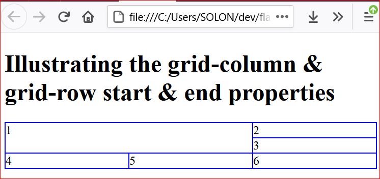
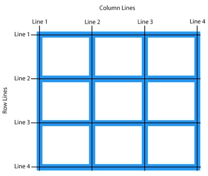
A simpler way to position elements in the grid is with line-based positioning. We can place an item from column line 1 to column line 3, and row line 1 to row line 3. It will then cover four grid cells in total, spanning two column tracks and two column rows.
Following illustrates a sample demonstration code :
 <!DOCTYPE html>
<html>
<head>
<style>
div {
  border: 1px solid blue;
}
.grid-container {
  display: grid;
  grid-template-columns: auto auto auto;

}

.item {
grid-column-start: 1;
grid-column-end: 3;/* this particular item spans 2 columns*/
grid-row-start: 1;
grid-row-end: 3; /* this particular item spans 2 rows*/
}


</style>
</head>
<body>

<h1>Illustrating the grid-column & grid-row  start & end properties</h1>

<div class="grid-container">
  <div class="item">1</div>
  <div>2</div>
  <div>3</div>
  <div>4</div>
  <div>5</div>
  <div>6</div>

</div>

</body>
</html>